Amadeus
White Label Self Service Design System
The White Label Self Service Design System
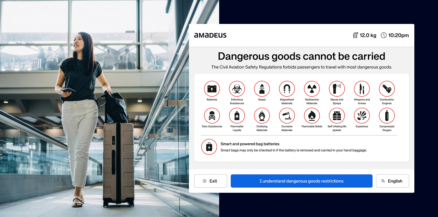
As Senior User Experience Designer for Amadeus' travel unit, I own the White Label Self Service Design System and UX strategy behind the company's self-service airport kiosks, bag taggers, bag drop, and biometric check-in, deployed at major airports including Heathrow, Changi, and JFK. I lead this work end-to-end across research, systems design, and delivery with engineering, and outside this project I sit on Amadeus' UX Heads group and lead Airport Ops UX for Australia & the Pacific.
The Challenge
The self-service platform was causing significant operational friction and a poor passenger experience.
- High Passenger Confusion: Users frequently mistook bag-tag kiosks for full check-in terminals, leading to wasted prints and increased staff workload.
- Inefficient Theming: Rebranding the UI for each new airport was a slow, manual process that created design inconsistencies and accessibility risks.
- Poor User Guidance: Critical on-screen instructions were often missed, causing errors in tasks like attaching bag tags.
The Solution
A Token-Based, Research-Led Approach
My strategy combined a scalable design system with continuous, data-informed UX improvements.
Figma Theming Architecture
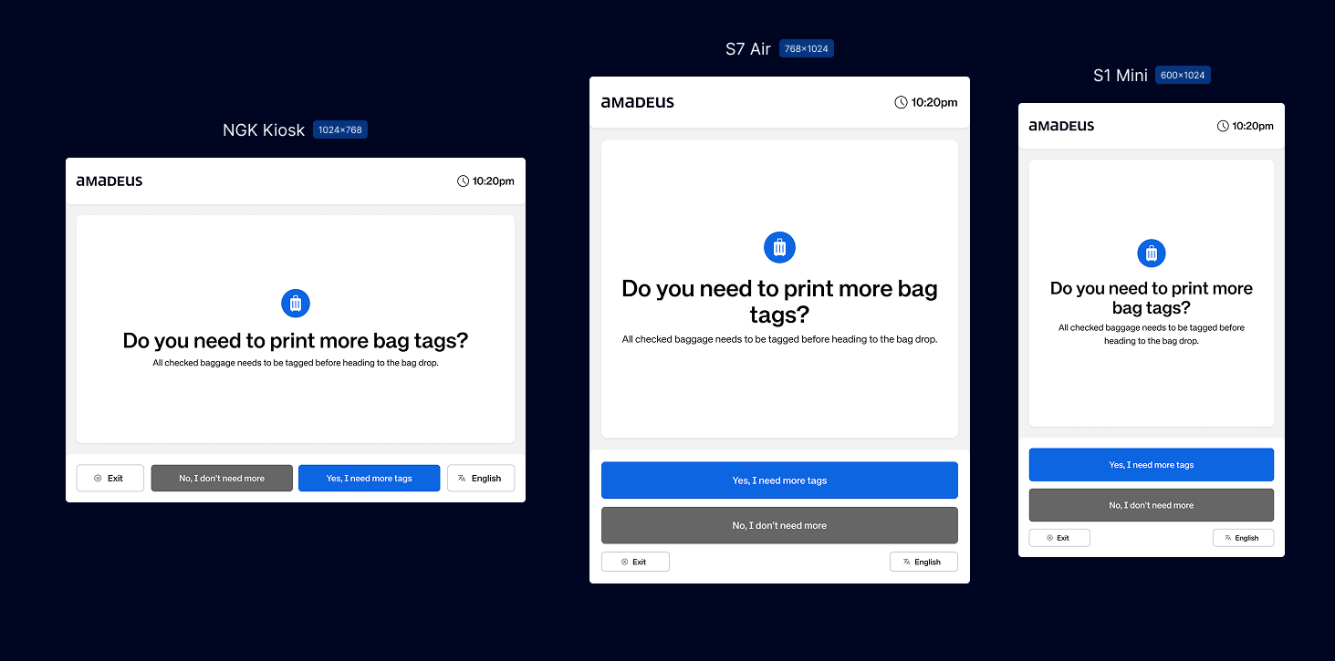
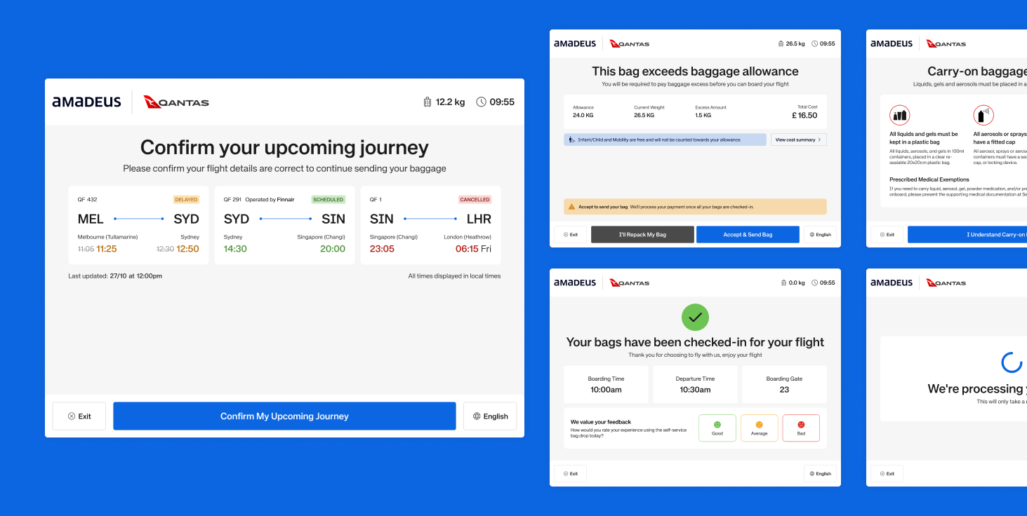
I designed and implemented a token-first theming system. Using design tokens for colour, typography, and spacing, we built a single, robust component library that let us instantly re-skin the entire UI for any airport brand without touching the core interaction logic, and gave every airport team a consistent, accessible baseline instead of a one-off build.
Custom Icons for a Custom Design System
None of the off-the-shelf icon sets actually fit what the White Label Self Service Design System needed, every airport comes with its own brand guidelines, so we built a custom set from scratch, one with full control over weight, corner treatment and line caps so each icon can flex to match whichever brand the site is built for. Owning the full set also means we're not locked into someone else's roadmap: when a new icon is needed, we add it straight into the design system's SVG sprite sheet, keeping everything in one governed source that scales cleanly across every airline and airport on the platform.
Research-Led UX Enhancements
Using insights from customer service agents, usability testing, and Datadog RUM, we targeted key friction points:
- Clarified Kiosk Purpose: Changed headline copy from “Check-in” to “Print Bag Tags.”
- Improved User Guidance: Introduced short, contextual animations during printer processing to teach correct bag-tag attachment.
- Reduced Waste & Errors: Added a confirmation step showing the number of tags to be printed, and redesigned the bag-selection page to clarify complimentary vs. paid allowances.
Results
- 90% Faster airport rebranding
- Design and engineering effort to deploy a new airport theme cut from weeks to hours
Reduced Passenger Confusion
Datadog RUM data showed a significant drop in session errors and unnecessary prints after deploying the new copy and confirmation screen.
Fewer Staff Interventions
On-site observations confirmed a higher rate of first-time success for tag attachment, freeing up roaming customer service agents to focus on complex issues.
Established a Data-Informed Design Process
Embedded Datadog RUM into our workflow, creating a continuous feedback loop to validate changes and prioritise high-impact fixes.